What I did
For this project I went through all of the processes of creating an animation, from pre-production, production, to post-production. In pre-production I made the idea for my animation, found out the cost of the equipment and materials, and created the storyboard, set and models with the help of Ryan Wylie. For production I worked as an animator with Ryan as the camera opperator. We took the photos of the models moving and occationaly swapped places, one example was when we were animating the UFO to go over the camera. Our arms often got tierd when holding the string that attached to the UFO so we took turns to prevent the UFO from becoming too far from being in the previous shot. Lastly was post-production where we edited the shot and gathered music and sound effects to help it become an animation. Both Ryan and I both made different versions of the animation while in this phase through. I edited the shots first then found music and sound effects to fit along with it.
What I liked
I really enjoyed creating the melting scene for the animation because it was fairly easy to create while still being fairly advanced to use in the animation. I created it by squishing some parts of the model down in each shot, giving it a fluid movement. This technical quality in the animation made it extremely interesting to look at. Coupled with the slime sound effects, it looked and felt like the character was melting. I'm really proud of this scene simply due to how fluid it looks. I also enjoyed creating the character models. The red character looks like a generic character that you would find in practically any movie or television seires and the alien is a generic humanoid alien that would not need that much creativity (or makeup) to create. Then there's the blue character who is a 4th wall breaker and has a very cynical view in the animation. I made the characters this way to see how they would interact in that situation.
What I disliked
I don't have that many problems with the animation however I did have a problem working in post-productionm that would effect the outcome of the animation. While in Premiere Pro I had a strange bug where the shots would be zoomed in to a strange amount. I had to zoom the entire video out just to see the frames I was editing. Then when I went to export the animation the video itself was extremely small, so it was difficult to see. I fixed this by going back into Premeire Pro and resize the video back to it's right size. This however affected the layout of the text boxes, and since I couldn't see what it would look like in the video I had to guess the sizes for the text. This however was the only major problem I had with the animation.
Feedback I recieved
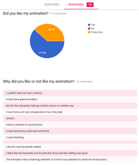
Here is the feedback I have recieved for the animation. This two questions ask did they like the animation and why. Both questions show that the majority of people did like the animation however 38.5% said that it was okay. The reason for this is mostly because of the text in the animation. People said that they couldn't read the text properly and that it could be shown in a better way. The people who did enjoy it said that it had some funny jokes here and there, and that it had some great animation, especially with the melting scene.
For this project I went through all of the processes of creating an animation, from pre-production, production, to post-production. In pre-production I made the idea for my animation, found out the cost of the equipment and materials, and created the storyboard, set and models with the help of Ryan Wylie. For production I worked as an animator with Ryan as the camera opperator. We took the photos of the models moving and occationaly swapped places, one example was when we were animating the UFO to go over the camera. Our arms often got tierd when holding the string that attached to the UFO so we took turns to prevent the UFO from becoming too far from being in the previous shot. Lastly was post-production where we edited the shot and gathered music and sound effects to help it become an animation. Both Ryan and I both made different versions of the animation while in this phase through. I edited the shots first then found music and sound effects to fit along with it.
What I liked
I really enjoyed creating the melting scene for the animation because it was fairly easy to create while still being fairly advanced to use in the animation. I created it by squishing some parts of the model down in each shot, giving it a fluid movement. This technical quality in the animation made it extremely interesting to look at. Coupled with the slime sound effects, it looked and felt like the character was melting. I'm really proud of this scene simply due to how fluid it looks. I also enjoyed creating the character models. The red character looks like a generic character that you would find in practically any movie or television seires and the alien is a generic humanoid alien that would not need that much creativity (or makeup) to create. Then there's the blue character who is a 4th wall breaker and has a very cynical view in the animation. I made the characters this way to see how they would interact in that situation.
What I disliked
I don't have that many problems with the animation however I did have a problem working in post-productionm that would effect the outcome of the animation. While in Premiere Pro I had a strange bug where the shots would be zoomed in to a strange amount. I had to zoom the entire video out just to see the frames I was editing. Then when I went to export the animation the video itself was extremely small, so it was difficult to see. I fixed this by going back into Premeire Pro and resize the video back to it's right size. This however affected the layout of the text boxes, and since I couldn't see what it would look like in the video I had to guess the sizes for the text. This however was the only major problem I had with the animation.
Feedback I recieved
Here is the feedback I have recieved for the animation. This two questions ask did they like the animation and why. Both questions show that the majority of people did like the animation however 38.5% said that it was okay. The reason for this is mostly because of the text in the animation. People said that they couldn't read the text properly and that it could be shown in a better way. The people who did enjoy it said that it had some funny jokes here and there, and that it had some great animation, especially with the melting scene.
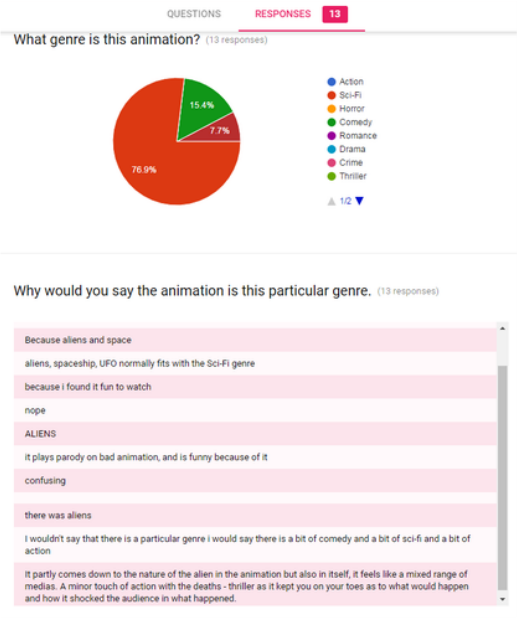
The next questions show what people thought the animations genre was. We were leaning on a Sci-Fi/Comedy animation, with most people agreeing with that. However there were a few people who though that it was in the action genre. When we asked why they thought it was in the action genre they said that they thought that it was a mix of both Sci-Fi, Comedy and Action because some parts blended so well together.
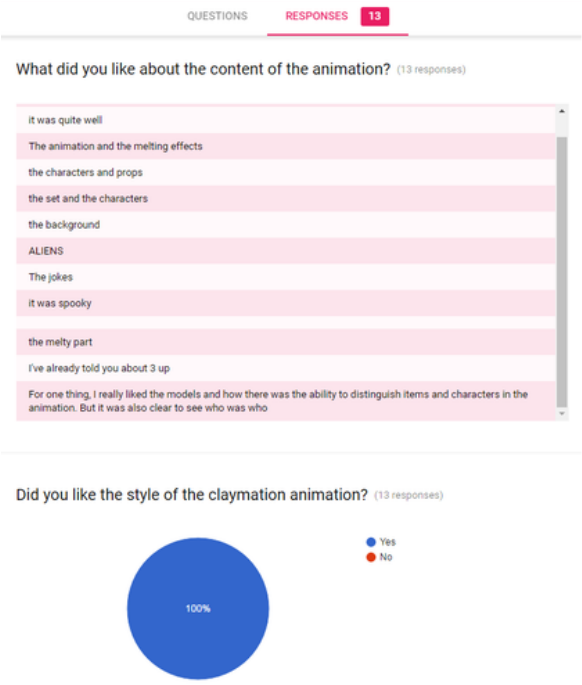
When asked about the content of the animation they said that some people said that they liked the melting scene and others said that they like the props in the animation. This means that all of the effort that went into creating and shaping the models payed off. When asked if they liked the style of the animation 100% said that they liked it.
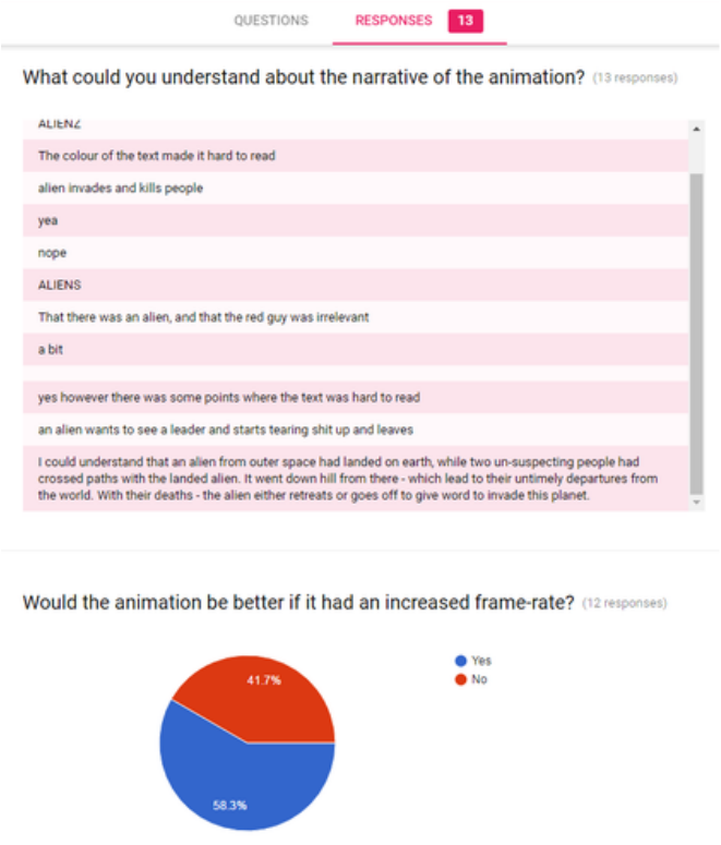
When asked about if they could understand the narrative some people said the text was hard to read, while others said that the alien invades and two people give their reactions to it. When asked if the animation would be better if it had an increased frame rate, the majority of people agreed. I agree to their desision because some parts of the animation did look jurky.
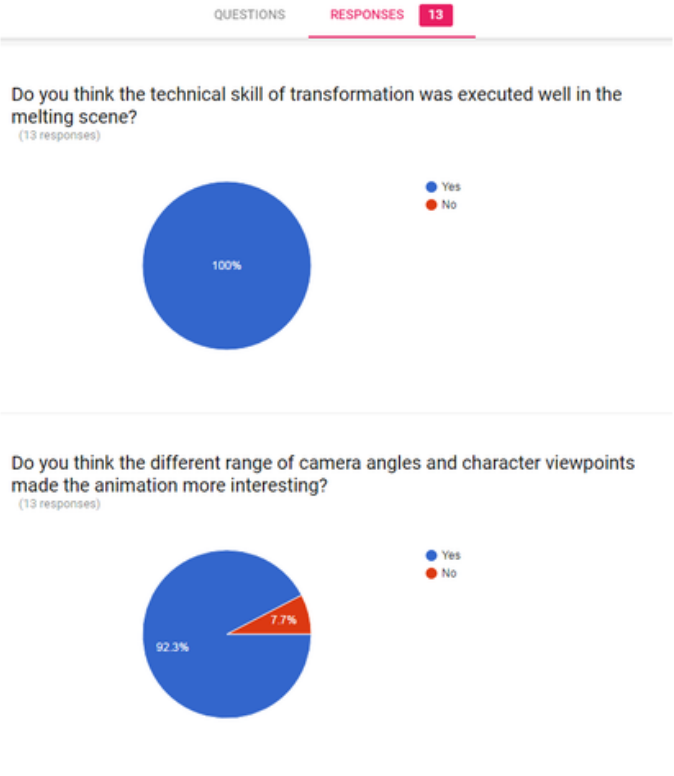
100% of people agreed that the technical skill for the melting scene was executed well in the animation. A majority also said that the different character viewpoints in the animation made it more interesting,
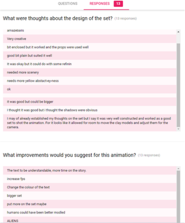
In the last parts of the questionnaire we asked what the audience thought about the design of the set. Some said that it needed more scenery because the set looked a little plain, while others said it was a little enclosed and the shadows were easily seen. This can be shown in what they would improve in the animation, to make the set more bigger and place more details in it. There is also the suggestion to increase the FPS for the animation and to make the text more larger and darker to help understand the characters. These improvements are something I wholeheartedly agree with and would deffinately improve upon if I did the animation again.
Overall thoughts
Overall the animation is different from what I had originally intended, for example the animation was to be voiced over instead of containing text bubbles, however had to be changed that way due to time restraints. Even though it's different you can still tell which character is talking thanks to the different coloured text, plus I didn't need to worry that much about lip-syncing their mouths to the letters. Even though the animation is different I'm still really proud of some of the scenes, like the melting scene.
If I could do it again
If I would do anything differently next time I would try not to rotate the set as much so that the lighting remains a little bit more consistent throughout the animation. I would also add more frames to make the animation a little less jerky and run more smoothly. I would also make the animation longer so that people can follow what the characters are saying. Most importantly though I would make the size and colour of the text more visible and last longer on the screen so that people can read it better.
Why I made the animation
I created the animation not just to poke fun at all the cliches, the main perpose of the animation is to show the cliches and to educate people on what to look out for. Of course not all cliches can be avoided however some are more acceptable and less noticable than others.
